Castbox Case Study by Farnoosh Bagheri

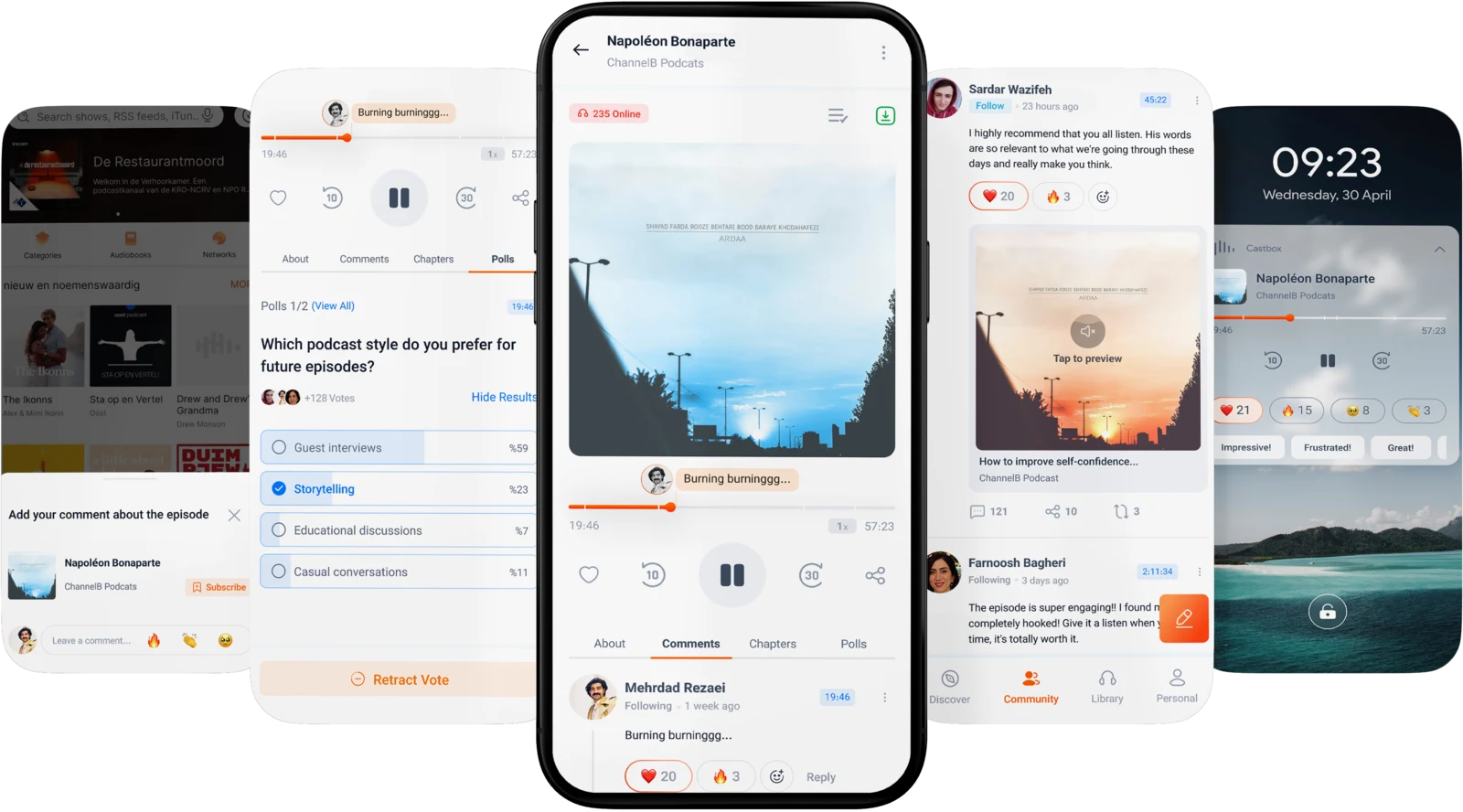
Enhancing Community Engagement on Castbox
by Redesigning the Information Architecture
A UX project to discover why the listeners face challenges interacting with the community section, and how layout clarification and organizing features enhance engagement.

My Role
I contributed to the overall design process and oversaw aspects related to product scoping, Ideation, sketching, and UI, rapid prototyping, and user feedback.
Additionally, I conducted user research, facilitated co-workshops, and contributed in synthesizing research findings to produce viable ideas.
Case Study Scope
Methods
- Assumptions, Desk Research
- Interviews, Survey
- Insights, Persona Profile
- Competitive Analysis
- Ideation, Prioritizations Matrix
- Crazy 8s, Sketching Ideas
- Wireframe, UI, Prototype
- 5 second Test, User Feedback
Objectives
- Enhancing user engagement
- Streamlining commenting process for listener users
- Strengthen community engagement
Team
2 Product designers
Duration
3 Weeks (Remote)
Tools
Figma, FigJam, Google Meet, Porsline

Castbox is a podcast player app with a wide range of categories for podcast lovers. I worked with another UX/UI designer improving the experience for users who left the application without sharing their comments through community.
We did our case study on the Castbox version (11.21.1-250312118) on the Android operating system.
Problem Discovery
Valuable feedback that could make a change, but is often missed
On Castbox, users often leave the application without sharing comments or feedback. Researches revealed that they have limited ways for in-depth feedback or interacting beyond basic ratings, which has contributed to a decline in community engagement.
81%
Background Listening
people of all ages find podcasts a convenient format when commuting, walking the dog, in the gym, or doing mundane tasks at home such as cleaning. Link
Followed the host’s social media account
65% of podcast listeners between 18-29 years Followed the social media account of a podcast or host, and 22% of them joining a online discussion group or social media group dedicated to a specific podcast. Link
Our Assumptions
Do the Context, Behavior, and Design affect engagement?
We started by identifying potential assumptions about the causes of low user engagement on Castbox by putting ourselves in the user’s perspective. These assumptions guided our research and informed the following design steps.
Context of Use Assumptions
Most users are busy while listening, so they can't interact right away.
✅ Validated
Long time intervals between uses may reduce engagement.
Behavioral Assumptions
Users see Castbox as a listening platform, not a social one. So prefer listening over engaging.
Listeners value interactions only if podcasters acknowledge them.
✅ Validated
Some listeners prefer private messages, while podcasters prefer public comments.
Product Assumptions
Users struggle to react to or share opinions on specific podcast parts.
✅ Validated
Many users miss Castbox's engagement features due to poor visibility of tools.
✅ Validated

Survey
Which patterns we recognised through user research?
We began our research by conducting a survey with 60 Castbox users who had used the app at least one month earlier. This survey was shared in the Castbox community on Telegram for 2–3 days. The data was collected through the Porsline platform.
- Engaged in other activities
- Fully focused
Listening Habits
Exploring whether users are engaged in other activities or fully focused while listening
- Old interface
- Inability to leave timestamped comments
- Poor comments categorization
- Inability to mention other listeners
- Nested display of replies
- Others
Community Challenges
Exploring the most important problems listeners have faced in the Castbox community.
- Talking with friends (in-person or online)
- Discussing on social media platforms
- Posting in the Castbox community section
- Others
Exchanging opinions
Exploring where and how listeners typically discuss podcasts they have listened to
The usage pattern of interval users showed no significant difference in how they engaged with the community, which led us to conduct interviews to better understand the reasons behind their lack of participation.
Interviews
Users turn to other platforms to engage because they think their opinions are seen, discussed and have an impact
We continued our research by conducting in-depth interviews with six participants. The interviews lasted an average of around 30 minutes. Participants were recruited through the “Willing to be interviewed” field included in the survey. The sessions were conducted via Google Meet, with one designer acting as the moderator and another as the note-taker, ensuring a consistent, comfortable environment that encouraged honest feedback.
6 important takeaways from Users’ Interviews
“I turn to other platforms for engagement because my opinions are seen, discussed, and have an impact on the podcast.”
“I’m doing other activities while listening to podcasts and I’m not focused on the app to engage with the community.”
“Posts on Community are not categorized based on different criteria and replies are nested.”
“I’m willing to write a review about a specific part of an episode because my opinion is related to a specific moment in an episode.”
“I don’t even know that the community exists.”
“The interface is old and not modern, which discourages me from engaging with it.”
Persona profile
Who are the listeners?
By categorizing our research insights, we identified 3 main user personas (archetypes) that guided our design decisions by highlighting the user needs, pain points, and behaviors, ensuring our solutions were user-centered and aligned with real expectations.
“My goal is finding a quick and effortless way to react or leave feedback without interrupting my current activity.”
The Multitasker
Athlete
The Multitasker listens to podcasts while engaging in other activities. They rarely interact with the Castbox community because they aren’t focused on the app when listening.
“My goal is a dynamic discussion space where my thoughts directly and quickly influence others. (ongoing conversations).”
The Sociable
Journalist
The Sociable wants their opinions to be seen, discussed, and acknowledged, so they prefer engaging on social media platforms where podcasters and their friends are more accessible.
“My Goal is to have a high control of the app in a modern way, such as post categorizing, leaving timestamped comments, and fast replies reading.”
The Tech Enthusiast
Developer
The tech enthusiast enjoys the structured, clean, and accurate architecture to better manage of their time and listening experience.
Competitive Analysis
The ability to interact while multitasking remains a gap in the market and presents an opportunity worth exploring
By analyzing Castbox's direct and indirect competitors, we looked for their strengths and weaknesses in user engagement to gain valuable insights into their strategies and uncovered potential opportunities for improvement. We discovered some similar and distinctive feature offerings across the apps, centered around goal tracking. However, the ability to interact while multitasking remains a gap in the market and presents a valuable opportunity to explore.
- SoundCloud
- Spotify
- Apple Podcast
- YouTube
- Telegram
visible & quick interactions
clear & structured community
in-app conversations
chaptered episodes & categorized comments
timestamped commenting
What did we find?
Comments and replies are clearly organized, making them more visible and easier to engage with.
- SoundCloud
- YouTube
- Spotify
The ability to comment on specific moments, quick reactions and replies.
- SoundCloud
- YouTube
Allowing users to send direct messages for in-app interaction with others.
- SoundCloud
Live streaming capability for better user engagement.
- YouTube
The ability to interact while multitasking remains a gap in the market and presents an opportunity worth exploring.
- Market Gap
Approaching user-centered solutions
Which ideas are most impactful and feasible to implement in the first iteration?
To answer this question and find solutions that effectively addressed the identified problems, we conducted an ideation workshop (Brain writing) based on the insights, personas and their needs. During this workshop, over 60 initial ideas were generated. After further evaluation, we narrowed them down to 24 final user-centered ideas, which we then categorized according to each persona. Finally we used an idea prioritization matrix to select Viable, Feasible, and Desirable ideas based on their potential impact against the effort required to implement them.
Crazy 8s workshop
Moving away from modern tools to speed up exploring creative ideas
To develop the selected ideas, we needed to visualize them to reduce design costs and make decisions about their implementation. That's why we ran the Crazy 8s workshop. After sketching and comparing them, we identified positive & strength points of each one to move to the UI phase.
Visual Design
Let’s begin shaping our initial ideas into a practical interface and see how they might be functional with user needs
In the UI design phase, we transformed our ideas and wireframes into a structured interface by improving the information architecture and focusing on visual hierarchy and clarity to keep users engaged throughout the experience.
Changes to the Playback page:
Castbox's current Design
Redesigned Version
Changes to the Comment section:
Castbox's current Design
Redesigned Version
Changes to the Community section:
Castbox's current Design
Redesigned Version
Adding a one-tap reactions feature to the lock screen:
Adding a Reminder feature for later engagements:
Impacts from User Feedback
“Seeing online listeners makes me feel part of a community!”
By redesigning the information architecture and adding new features, we expect an increase in average user engagement on Castbox. We conducted Google Meet sessions with five users to gather feedback on the new design. The most common feedback we received from them during the user feedback sessions is as follows.
“This new layout makes it easier for me to read posts and comments, and replies.”
“I’ve always looked for a way to share my emotions in the moment”
“The design is modern, clear and structured and encourages me to share my thoughts.”
Success Metric
What would we measure If we were a part of Castbox?
Let’s imagine that we are designers at Castbox with access to user behavior data. To measure design success, we would examine users who have listened to at least one episode in the past month.
During a one-month period, we would collaborate with the data analyst team to examine user behavior and determine whether the engagement rate of an individual user increases in relation to the number of episodes they have listened to. If the rate increases compared to the previous one-month period, we can conclude that the design has contributed to an increase in engagement rates.
Challenges and Constraints
We updated the plan when things didn't go according to plan
During this time, we faced some challenges and some aspects did not go according to plan. We came up with various ideas for the Multitaskers such as quick reactions via shaking the phone, tapping on headphones or smartwatches, voice comments, etc.
However after consulting with developers and considering technical limitations and high effort required, we shifted to more cost-effective alternatives.
Project Takeaways
Check the Information Architecture before adding new features!
In this project, we learned that low engagement isn’t just due to the absence of certain features, but also lack of structured layout and personalization. Castbox has many features; however, due to its poor layout and lack of visibility, many users faced challenges in finding what they needed.
Additionally, the lack of content personalization and limited user control over the application often led to the display of irrelevant content, discouraging them from the product and ultimately leading to disengagement. I’ve always thought that adding new features would satisfy users, but this project made me realize that sometimes, small changes in information architecture can create great value and improve the user experience.
That’s it! I really appreciate the time you spent
We would like to thank ✏️ Marzie Nadali (UX Leader turned Entrepreneur) for being our mentor and helping us implement this case study.
May 2025
For any collaboration, feel free to contact me!
📩 farnooshbagheriii@gmail.com